
Configuring an Output Canvas
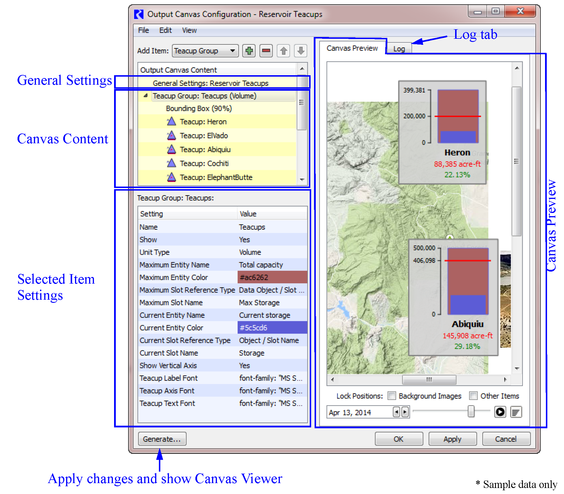
The Output Canvas configuration dialog allows you to create or change a canvas. It consists of the following areas, as shown in Figure 6.3.
• General Settings: aspects of the configuration which apply to the entire Canvas, e.g., the name of the Canvas, the height and width, and the background color.
• Canvas Content: Specification of the content to be included in the Canvas.
• Selected Item Settings: Control of the Canvas formatting as specified on a per-item basis.
• Canvas Preview: View the Canvas to quickly see what it will look like and arrange the items as desired.
• Log tab: Status, warnings and errors are posted to the log tab.
In the remainder of this section, each of these areas is described in more detail.
Figure 6.3
The following sections describe all the pieces of the Output Canvas.
General Settings
The General Settings item display settings apply to the entire Output Canvas. To change a setting’s value, select the appropriate value cell, enter the new value and press Return (or select outside the editing window). See General Settings for details.
Canvas Content
You control the content of the Canvas in the Canvas Layout area. This content is organized by items, and you specify the Canvas contents by indicating which items should be included. Table 6.1 gives a description of each item and lists all the features you can show on a Canvas.
Item | Description |
|---|---|
Settings which apply to the entire canvas. This is always shown and cannot be deleted. | |
Teacups are shown in groups so that all data is consistent across the group. The Teacup Group defines the slots to use, where they are located, the size of the bars in the teacup, and the fonts for the label, axis, and text items. Teacup Groups can have bounding boxes, text items, and markers that are displayed for each teacup. In addition, a Teacup Group can have a Teacup legend to provide a key; see Teacup Legend. | |
A Teacup Legend is part of a Teacup Group and provides a key to the teacups. The maximum value, the current value, markers, text and the units are shown in the legend. | |
A teacup is shown for an object in the model. You can modify the name and change the corresponding data object, if necessary. | |
The Object Icon Group contains RiverWare icons representing the objects shown on the workspace. Object icons are shown in groups so that the text labels are consistent. Object Icon Groups can have bounding boxes and text items that are displayed for each Object icon. | |
The Object Icon specifies the Object to include in an Object Icon Group. You can also specify the labels to show and size for each icon. | |
Markers, representing a slot value, are horizontal lines shown on each teacup. Markers are added to the Teacup Group. You specify the line color, style and the slots to use. | |
A text group is a container for free standing text on the canvas. You can name the group and specify the font to use for all text items in the group. | |
There are two kinds of text items: 1. Free-standing text items are single-lines of text shown on the canvas. 2. Text items in teacup groups are single-lines of text shown below the teacup label of each teacup. Text items represent static text, one slot value, or the relationship of two slot values or a timestep. You specify the type of text you want and the corresponding slots. Also specify the color and any prefix or suffix text. | |
For better appearance, you may wish to add Bounding Boxes to Teacup Groups or Object Icon Groups so that a box is drawn around each teacup or icon. You can specify the color of the background and its opacity and the border color. | |
Flow Lines are shown in groups so that all items are consistent across the group. The Flow Line Group defines the unit type, minimum, and maximum values and their respective thicknesses along with the interval configuration. Optionally, define the slots representing thresholds at the group level or configure to specify thresholds at the flow line level. | |
The Flow Line item is part of a Flow Line Group. The Flow Line defines the specific slot to use. Optionally define thresholds to use on that flow line. | |
The Flow Line Legend provides a key to the intervals and thicknesses of lines in the Flow Line Group. | |
The Canvas Line Group is a container for Canvas Lines. Canvas Lines in the group have the same thickness, color, symbol type and size. | |
Canvas Lines are used to create pointers or other line indicators on the canvas. Canvas lines are polylines with as many nodes as needed. | |
Image Groups are containers for Images. | |
You can add any jpg or png image to an image group. The image is then embedded in the output device. Also specify if it is on the foreground layer or background layer. | |
Chart Groups are containers for charts. | |
A Chart item is used to show a previously defined Chart within a Chart Group. |
The following operations allow you to create the Canvas layout and arrange its items as desired:
• Add Item 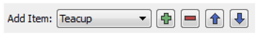 Use the menu to select an item to add to the layout. Select Plus
  to add the selected item. This button is active only when the item can be added. For example, Teacups must be added when a Teacup Group is selected.
Use the menu to select an item to add to the layout. Select Plus to add the selected item. This button is active only when the item can be added. For example, Teacups must be added when a Teacup Group is selected. • Select Minus  to delete an item from the list.
to delete an item from the list.• The Move arrows: These buttons can be used to move the selected item up or down when possible.
• Edit operations: The following standard edit operations can be accessed via the right-click context menu or the Edit Layout menu: Cut, Copy, Paste, Delete.
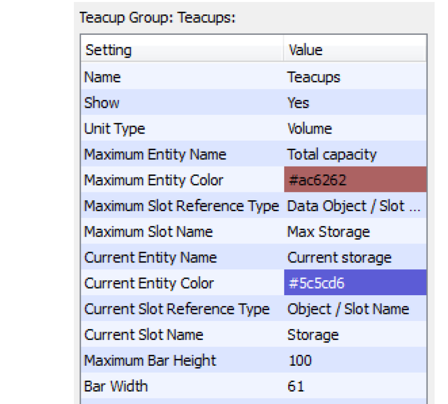
Selected Item Settings
The Selected Item Settings area allows you to control the appearance of individual Canvas items. This area lists the settings that apply to the item currently selected in the Output Canvas Content area, and allows editing by selecting the current setting value. See Canvas Items Reference for details.
Revised: 08/02/2021