Data Views - Plots of Data Sets Series Slots
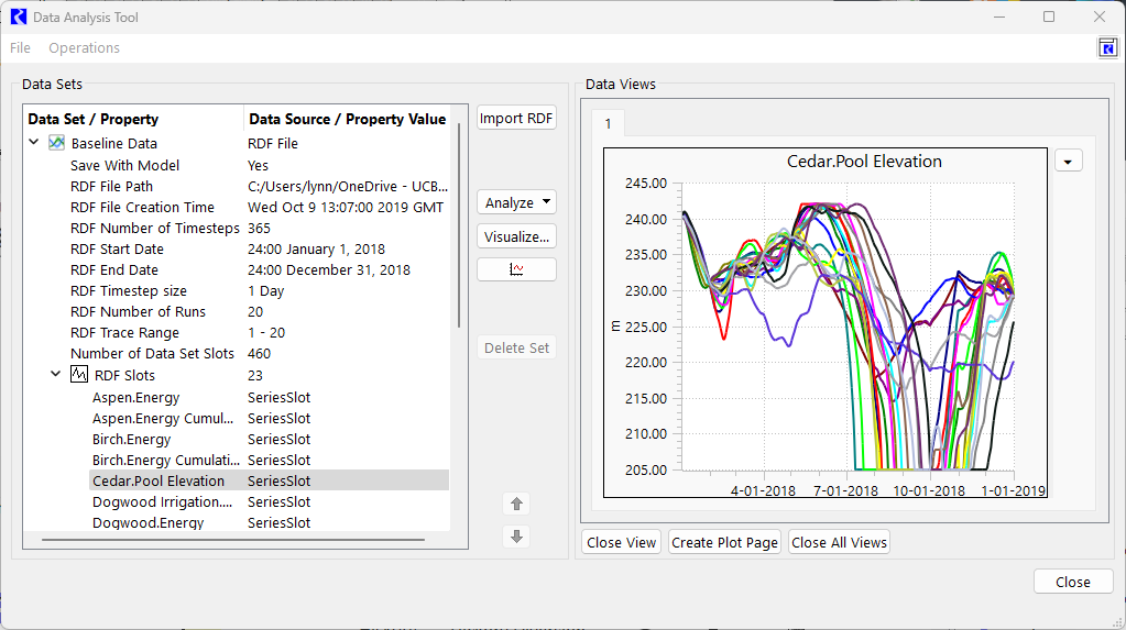
The DAT displays a graphical visualization as Data Views in the panel on the right. Each Data View is a tab in the panel. A sample screenshot with the Data Views panel is shown in Figure 7.14.
Figure 7.14 Screenshot of Data Analysis Tool Selected Data Set panel
To create a view, there are two approaches:
1. In the DAT, select either a Data Set or a slot and use the Create Data Views button  to quickly create line plots. With an entire Data Set selected, there will be one Data View / tab for each slot. If you have an individual slot selected, only that slot will be shown as a new tab in the Data Views.
 to quickly create line plots. With an entire Data Set selected, there will be one Data View / tab for each slot. If you have an individual slot selected, only that slot will be shown as a new tab in the Data Views.
 2. Use the Visualize button to create a custom data view. Select the desired slots, traces, time range and destination for the data views. See Visualizing Data Sets for more information.
Tip: The plots created will typically use the Default Curve Configuration settings described in Configuration Defaults. You can configure the colors, line types, and other attributes there for trace based curves using Curve Order or for summary statistics using Curve Label settings.
The following Data Views are currently supported:
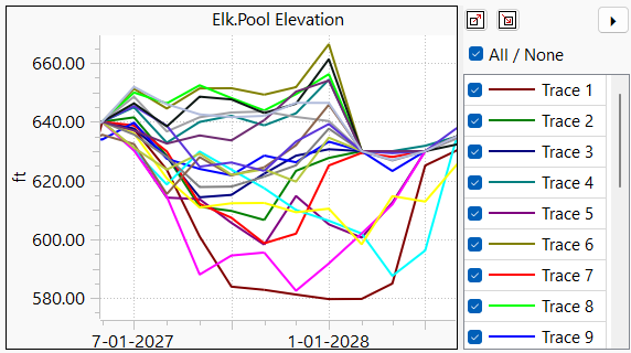
• Series data from RDF data sets can be plotted as over-plotted lines, also called spaghetti plots.
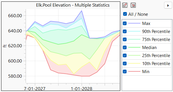
• The results of a Multiple Statistics analysis can be plotted as lines and shaded regions
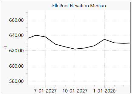
• Results of an Analyze Ensemble Data Set action can be plotted as a single line.
 A s
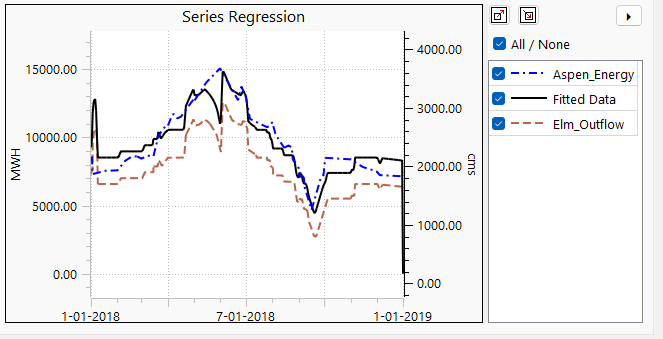
A s• Results of a Compute Series Regression action shows the independent, dependent and fitted data. Note, only two unit types can be shown, one per each y-axis.
Use the following buttons to perform operations on the Data Views.

• Close View: Close the current view only.
• Create Plot Page: Create a Plot Page in the Output Manager for the current view. Once in the Output Manager, you can further customize all aspects of the plot.
Note: Creating a plot page of a Multiple Statistics that includes shading between curves is possible but there is little support for the shading in the Plot Page. There is currently no capability to change colors or opacity.
• Close All Views: Close all the Data View tabs.
View the legend and filter the visibility of the curves using the Legend/Filter button  :
:
 :
: Figure 7.15 Legend and Filter panel shown in the DAT
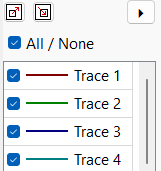
Select individual curves to hide or show or use the All/None button as needed. Once you have it configured as desired, you can copy and apply that filter using one of the following approaches:
• Select the Copy Visibility Filter button  switch to a different Data View and then select the Apply Visibility Filter button
  .
.
 switch to a different Data View and then select the Apply Visibility Filter button
  .
.• In the Operations menu, select the options to Copy/Apply Visibility Filter from Data View.
• Use the right-click context menu on the plot itself to Copy Curve Visibility Filter and similar option to apply it to a different Data View.
Within the Data View, the operations are similar to other plots in RiverWare. Hover over a curve to see the run/trace number, date and value:
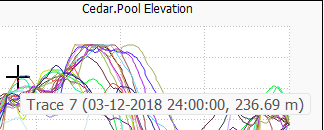
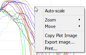
Draw a rectangle to zoom in. Click and drag the middle mouse button to pan the plot. Right click on a plot area for additional plotting functionality as shown in Figure 7.16.
Figure 7.16 Data Analysis Tool Plotting controls.
Tip: To see further customize the plot, use the Create Plot Page button. Then you can edit and save the Plot Page.
Revised: 01/09/2026