
Canvas Items Reference
This section provides details about the settings that apply to each type of Canvas item.
General Settings
These are settings that apply to the entire canvas. This is always shown and cannot be deleted.
Setting | Type | Notes |
|---|---|---|
Name | Single line text | |
Canvas Width | Value in pixels | |
Canvas Height | Value in pixels | |
Background Color | Color Chooser | See Color Chooser for details. |
Timestep | Datetime Text | Usually the date shown is controlled by the date controls in the preview or on the canvas itself |
Show on Simulation View | Yes/No | Show supported items on the appropriate workspace view. See Showing Canvas Items on the Workspace for details. |
Show on Geospatial View | Yes/No |
Teacup Group
Teacup Groups are a container for Teacups so that all data is consistent across the teacups in the group. The Teacup Group defines the slots to use, where they are located, the size of the bars in the teacup, and the fonts for the label, axis, and text items. Teacup Groups can have bounding boxes, text items, and markers that are displayed for each teacup. In addition, a Teacup Group can have a Teacup legend to provide a key. See Teacup Legend and Instructions for Creating a Teacup Diagram for additional information.
Setting | Type | Notes |
|---|---|---|
Name | Text | |
Show | Yes/No | |
Unit Type | Menu Selection | Values shown will use the Unit Scheme definition for the specified Unit Type. Select View, then Unit Scheme Manager to see the scheme. |
Precision | Selection | Select the precision of numeric values shown. See Precision for details. |
Maximum Entity Name | Text | |
Maximum Entity Color | Color Chooser | See Color Chooser for details. |
Maximum Slot Reference Type | Object/Slot Name or Data Object/Slot Name | Choose whether the specified Maximum slot is on the object itself or an accompanying data object. See Slot Reference Type for details. |
Maximum Slot Name | Slot Selection | The slot used for the larger bar on the teacup. See Slot Selections for details. |
Current Entity Name | Text | |
Current Entity Color | Color Chooser | See Color Chooser for details. |
Current Slot Reference Type | Object/Slot Name or Data Object/Slot Name | Choose whether the specified current slot is on the object itself or an accompanying data object. See Slot Reference Type for details. |
Current Slot Name | Slot Selection | The slot used for the smaller (current) bar on the teacup. See Slot Selections for details. |
Teacup Geometry | Selection | The shape of the teacups. Select either rectangular, trapezoidal congruent, or trapezoidal constant Top/Bottom. See Teacup Geometry for details. |
Show Gap | Yes/No | Specify if there is a horizontal gap between the current and maximum value. See Show Gap for details. |
Maximum Teacup Height | Number | Height of the largest teacup in the group. |
Teacup Width | Number | Width of all the rectangular teacup bars in the group. |
Teacup Bottom Width | Number | Width of the bottom of all the trapezoidal teacups. |
Teacup Top Width | Number | Width of the top of all the trapezoidal teacups (Constant Top/Bottom) |
Show Vertical Axis | Yes/No | |
Label Font | Font Selector | The font used for the teacup labels. |
Axis Font | Font Selector | The font used for the teacup axis. |
Text Font | Font Selector | The font used for all text items in the group. |
Teacup Legend
A Teacup Legend is part of a Teacup Group and provides a key to the teacups. The maximum value, the current value, markers, text and the units are shown in the legend.
Teacup
A teacup is shown for the selected objects. You can modify the name and change the corresponding data object, if necessary. See Instructions for Creating a Teacup Diagram for details.
Setting | Type | Notes |
|---|---|---|
Label | Text | The text used for the label on the teacup. |
Reference Object | Object Selection | Use the selector to select the object for this teacup. Usually this is a Reservoir object. |
Reference Data Object | Object Selection | Use the selector to select the data object related to the reference object. This is usually located automatically if available. |
X Position | Number | See Position for details. |
Y Position | Number | See Position for details. |
Object Icon Group
The Object Icon Group contains RiverWare icons representing the objects shown on the workspace. Object icons are shown in groups so that the text labels are consistent. Object Icon Groups can have bounding boxes and text items that are displayed for each Object icon.
Setting | Type | Notes |
|---|---|---|
Name | Text | The name of the group as shown in the Output Canvas Content group |
Show | Yes/No | |
Precision | Selection | Select the precision of numeric values shown. See Precision for details. |
Label Font | Font Selector | The font used for all Object Icon Labels |
Text Font | Font Selector | The font used for all text items added to the Object Icon Group |
Object Icon
The Object Icon item specifies the Object(s) to include in an Object Icon Group. You can also specify the labels to show for each icon.
Setting | Type | Notes |
|---|---|---|
Label | Text | The label to use for the icon. |
Reference Object | Object Selection | The object for which you would like to show the icon |
Reference Data Object | Object Selection | Use the selector to select the data object related to the reference object. This is usually located automatically if available. |
X Position | Number | See Position for details. |
Y Position | Number | See Position for details. |
Scale | Number | Specify the relative scale of the icon. The valid range is from 20-200% |
Marker
Markers, representing a slot value, are horizontal lines shown on each teacup. Markers are added to the Teacup Group. You specify the line color, style and the slots to use.
Setting | Type | Notes |
|---|---|---|
Label | Text | The text used for the marker on the legend. |
Line Color | Color Chooser | See Color Chooser for details. |
Line Style | Menu | |
Slot Reference Type | Object/Slot Name or Data Object/Slot Name | Location of the slot to use for the marker. See Slot Reference Type for details. |
Slot Name | Slot Selection | The slot used for marker. See Slot Selections for details on this selection. |
Text Group
A text group is a container for free standing text on the canvas. You can name the group and specify the font to use for all text items in the group.
Setting | Type | Notes |
|---|---|---|
Name | Text | This text is used to identify the group |
Show | Yes/No | |
Precision | Selection | Select the precision of numeric values shown. See Precision for details. |
Font | Font Selector | The font used for all Text Items in the group. |
Text Item
There are two kinds of text items: 1. Free-standing text items are single-lines of text shown on the canvas. 2. Text items in teacup groups are single-lines of text shown below the teacup label of each teacup.
Text items represent static text, one slot value, or the relationship of two slot values or a timestep. You specify the type of text you want and the corresponding slots. Also specify the color and any prefix or suffix text.
Setting | Type | Notes |
|---|---|---|
Text Type | Menu Choice | Select one of the types of text. See Text Types for details. |
Text Color | Color Chooser | See Color Chooser for details. |
Prefix Text | Text | String to include before the Text Item |
Suffix Text | Text | String to include after the Text item |
Slot 1 Reference Type | Object/Slot Name or Data Object/Slot Name | Location of the slot to use for the text item. See Slot Reference Type for details. |
Slot 1 Name | Slot Selections | See Slot Selections for details. |
Slot 2 Reference Type | Object/Slot Name or Data Object/Slot Name | Location of the slot to use for the marker. See Slot Reference Type for details. |
Slot 2 Name | Slot Selections | For Text items that show or use two values, this is the second slot. It is only shown for Text items with two slots. |
Legend Text | Text | The text that is displayed on the legend. |
Bounding Box
For better appearance, you may wish to add Bounding Boxes to Teacup Groups or Object Icon Groups so that a box is drawn around each teacup or icon. You can specify the color of the background and its opacity and the border color.
Setting | Type | Notes |
|---|---|---|
Show | Yes/No | |
Opacity | Number | This value must be between 0 and 100, inclusive. |
Background Color | Color Chooser | See Color Chooser for details. |
Show Border | Yes/No | |
Border Color | Color Chooser | See Color Chooser for details. |
Flow Line Group
Flow Lines are shown in groups so that all data is consistent across the group. The Flow Line Group defines the unit type, minimum, and maximum values and their respective thicknesses along with the interval configuration. See Instructions for Creating a Flow Line Diagram for details.
Setting | Type | Notes |
|---|---|---|
Name | Text | |
Show | Yes/No | |
Unit Type | Menu | The Unit Type to use for all flow lines in the group. |
Minimum Value | Number and units | The value representing the minimum. Any values less than this will be shown with the minimum thickness. |
Minimum Thickness | Number of pixels | The thickness corresponding to the minimum value. See Flow Line Thickness for details on thickness. |
Maximum Value | Number and units | The value representing the maximum. Any values greater than this will be shown with this thickness. |
Maximum Thickness | Number of pixels | The thickness corresponding to the maximum value. See Flow Line Thickness for details on thickness. |
Interval Definitions | Number of intervals | Select the button to open a dialog where the intervals are defined. See Flow Line Color and Style for details. When finished, the number of intervals is shown. |
Flow Line
The Flow Line item is part of a Flow Line Group. The Flow Line defines the specific slot to use along with the thresholds to use on that flow line. See Instructions for Creating a Flow Line Diagram for details.
Setting | Type | Notes |
|---|---|---|
Label | Text | The flow line label. |
Reference Slot | Slot Selection | The Slot that provides the values for the Flow Line. |
Threshold 1 ... | Number and units | As configured in the Flow Interval Definition, each flow line will have the same number of Thresholds. Specify the value for each threshold. See Flow Line Color and Style for details. |
... Threshold 8 | Number and units |
Flow Line Legend
A Flow Line Legend can be added to a Flow Line Group to provide a key that describes the intervals defined in a flow line group and show sample lines that represent the thickness at various values.
Setting | Type | Notes |
|---|---|---|
Flow Line Legend Label | Text | The label to show at the top of the legend. |
X Position | Number | See Position for details. |
Y Position | Number | See Position for details. |
Flow Line Legend Values | Number of Sample Values | Select the setting and then click the button to open a dialog in which you define the sample values. See below for details. When finished, the number of sample values is shown. |
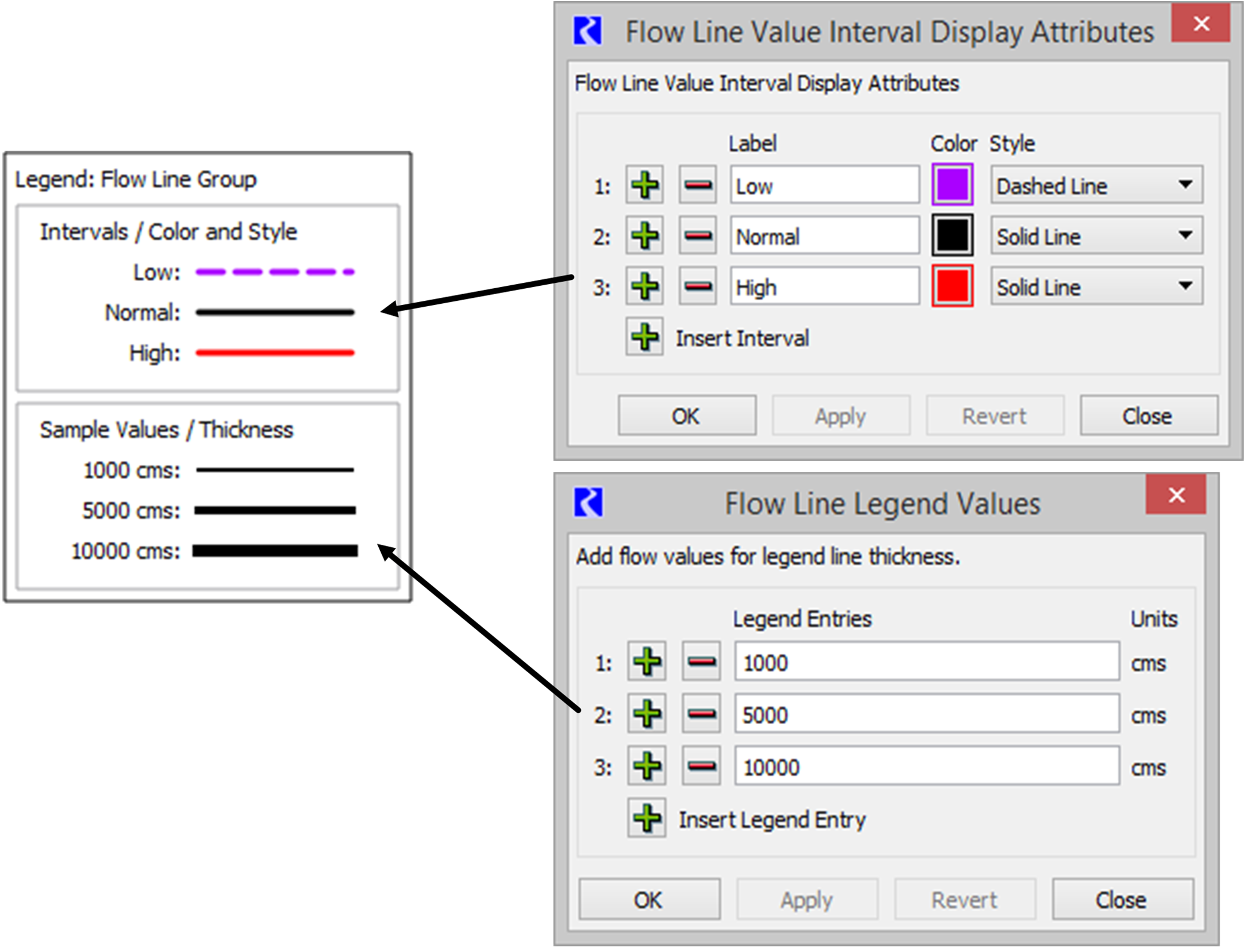
As shown in Figure 6.4, the top part of the legend provides a key to the intervals defined on the Flow Line Group. The intervals are defined and labeled on the Flow Line Group through the Interval Definitions setting. See Flow Line Color and Style for details.
The bottom panel in the legend provides a key to the line thickness and the values they represent. You define which values you would like to show. In the Flow Line Legend Value setting, click the button to open the dialog. Use the plus and minus buttons to add/delete entries. For each sample defined, a solid black line will appear in the legend with the appropriate thickness with respect to the Flow Line Group's minimum and maximum flow values and their defined thickness.
Figure 6.4 Screenshot showing a Flow Line Legend and the configuration dialogs
Canvas Line Group
The Canvas Line Group is a container for Canvas Lines. Canvas Lines in the group have the same thickness, color, symbol type and size.
Setting | Type | Notes |
|---|---|---|
Name | Text | |
Show | Yes/No | |
Line Thickness | Number of Pixels | The thickness of the lines |
Line Color | Color Chooser | See Color Chooser for details. |
Symbol Type | Menu | Select either None, Arrow, Dot, or Triangle. The symbol is only shown on one end of the line. |
Symbol Size | Number | Specify the size of the symbol. |
Symbol Color | Color Chooser | See Color Chooser for details. |
Canvas Line
Canvas Lines are used to create pointers or other line indicators on the canvas. Canvas lines are polylines with as many verticies as needed.
Setting | Type | Notes |
|---|---|---|
Label | Text | The canvas line label. |
Image Group
Image Groups are containers for Images.
Setting | Type | Notes |
|---|---|---|
Name | Text | |
Show | Yes/No |
Image
You can add any jpg or png image to an image group. The image is then embedded in the output device. Also specify if it is on the foreground layer or background layer.
Setting | Type | Notes |
|---|---|---|
Name | Text | By default, this is the original image file name. |
Layer | Foreground/Background | Select the layer on which the image lives. Background images can be separately locked into position on the Canvas Preview. |
Image Opacity | Number | This value must be between 0 and 100, inclusive. |
X Position | Number | See Position for details. |
Y Position | Number | See Position for details. |
Scale | Number | Specify the relative scale of the image. Either enter the number as a setting (20-400%) or drag the re-scale icon on the canvas to resize.  |
Chart Group
A chart group is a container for Chart items.
Setting | Type | Notes |
|---|---|---|
Name | Text | |
Show | Yes/No |
Chart
Chart items contain a reference to an existing Chart output device within the model. The chart is drawn with the canvas' reference timestep date/time. The canvas is drawn either with its native background color or with a background and frame specified by an optional “Bounding Box” added to the containing Chart Group. This is similar to the bounding box support for Teacups and Teacup Groups.
Setting | Type | Notes |
|---|---|---|
Chart Name | Selection | Select the name of the previously configured chart device. |
Width | Number | The width of the chart in pixels. See Chart Configuration for details on chart sizing. |
Height | Number | The height of the chart in pixels. See Chart Configuration for details on chart sizing. |
Scale | Percent | Scaling factor; must be less than or equal to 100%. See Chart Configuration for details on chart sizing. |
X Position | Number | See Position for details. |
Y Position | Number | See Position for details. |
Revised: 07/17/2020