Additional Information on Certain Settings
The following sections provide additional information that is shared among one or more settings.
Color Chooser
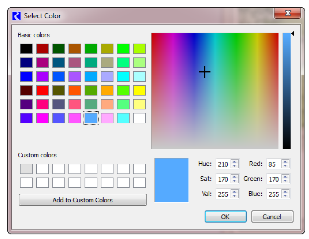
For all of the colors settings on the canvas, the settings allow you to specify the color in a number of ways. Usually you should use the color selector to specify the desired color. You can select the color from the palette, specify RGB values, or specify Hue/Sat/Val from the dialog. From the text setting, you can also type the hexadecimal color or type in an HTML color name.
Position
For all of the X and Y Position Settings, you can do the following:
• Specify the coordinates on the canvas as the number of pixels from the top left. This provides a fine level of control over the positions.
• Drag the item on the canvas. (preferred)
When either the number is changed or the item is dragged on the canvas, the other updates accordingly.
Precision
For Teacup, Text, and Object groups, select the precision of numeric values shown. Choose from a fixed precision 0-6 or use the precision defined on the Unit Scheme. Select View, then Unit Scheme Manager to see the scheme.
Slot Reference Type
For all of the Slot Reference Type settings, choose whether the slot is on the reference object or its accompanying data object. Object/Slot Name is for the specific object. Data Object/Slot Name is for the accompanying data object. The Output Canvas will try to find an accompanying data object by searching for the object’s name and the string “Data”. You can modify the data object to use if it is not correctly found. See Output Devices for Aggregated Values for details on creating aggregated data for display in this or other output devices.
Slot Selections
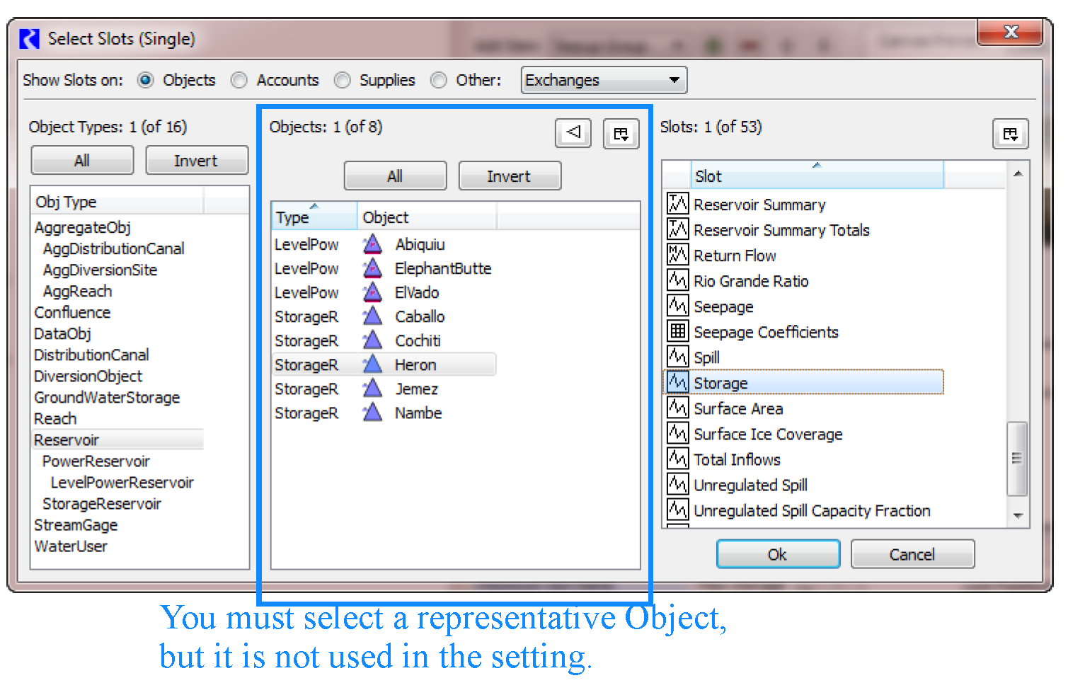
Specify the slot name or use the selector to select a representative slot. For these, you are choosing the slot only, but to do this, you must select a specific object first. The Object part is removed and only the Slot Name is used.
Figure 6.5
Following are some special provisions regarding the slots:
• When a multiple-column slot is selected, the slot's first column matching the Teacup Group's unit type is used.
• For the Maximum slot:
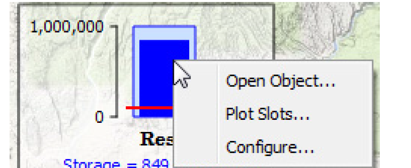
– When a Series Slot or Periodic Slot is used, the maximum value found within the slot column is used. With this in mind, you can pick the same series slot for both Maximum and Current teacup values, i.e. Storage. Then the teacup will show current Storage compared to largest Storage in that series.
– When a Table Slot is used, the value in the last row is used. This allows use of Reservoirs' Elevation Volume Table for the maximum Storage value.
Text Types
The Text Item allows you to show text or values on each teacup, object icon, or on the canvas. Specify the type of text using the Text Type setting. Table 6.2 shows the possible values and gives a description of each.
Note: Prefix and suffix settings are available for all except the Plain Text. In the Example column, the prefix and suffix are normal text while the filled in value is Bold.
Text Type | # of Slots | Notes | Example |
|---|---|---|---|
Plain Text | 0 | Static text. Prefix and Suffix are not supported. Edit the text in the in line text editor or use the dialog for longer text. Line breaks are supported. | CURRENT RESERVOIR CONDITIONS |
Value | 1 | Display the value of a slot. | Storage = 454,323 acre-feet |
Value (Priority) | 1 | Display the value of a slot and its priority. | Storage = 454,323 acre-feet (Priority 32) |
Value / Value | 2 | Display the value of a two slots separated by “/”. | Big Res has 5,342 m3 / 6000 m3 possible |
Percent | 2 | Display the computed percent of the two slot values. | Storage = 89.0% full |
Percent Maximum | 1 | Display the computed percent of the current value to the maximum value found in the slot. These are only available for text items in Teacup Groups | Storage = 73.1% of modeled maximum |
Timestep | 0 | Display the canvas’ timestep as a text label. This is particularly useful when exporting the canvas to an image or a Model Report where the timestep controls aren’t shown. | Timestep: Feb 14, 2013 |
Fitting Teacups and Object Icons
If you want your teacups and object Icons to match the general layout of your simulation view, you can select Edit, then Fit Teacups using Simulation View positions. This rearranges all existing Teacups and Objects with respect to the positions of the corresponding simulation objects within the simulation view.
Log
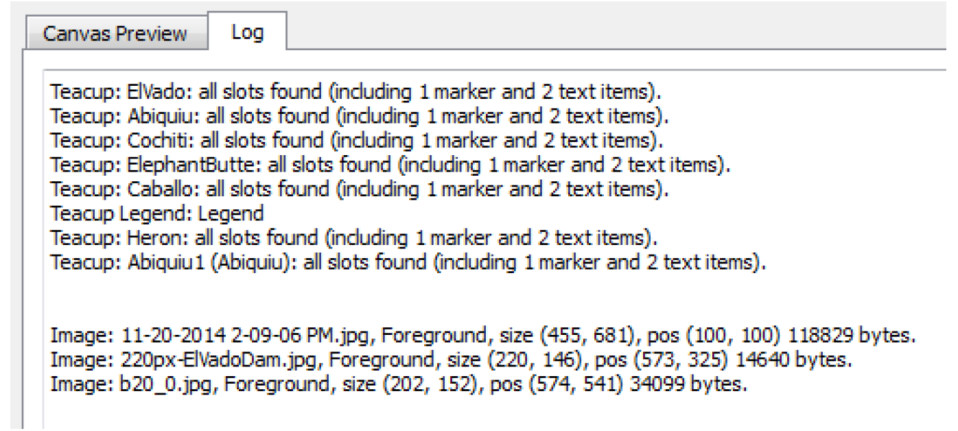
This tab provides a textual description of the Canvas generation process. The log contains details such as whether slots were found or not and image size and position. When a problem occurs during generation, the details will be reported here.
Teacup Configuration
This section describes additional configuration options for Teacups, particularly the geometry and appearance.
Teacup Geometry
For any particular teacup group, you can choose between the following Teacup Geometry options.
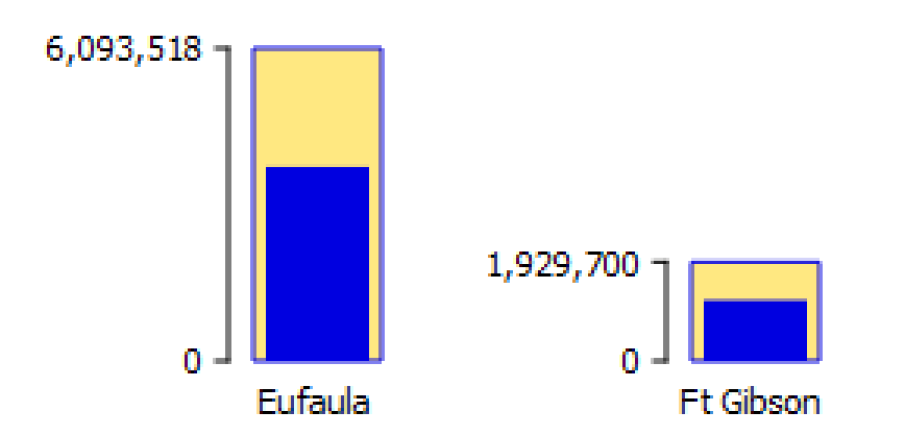
• Rectangular: Each teacup is shown as an equal width rectangular bar.
Figure 6.6
• Trapezoidal, Congruent: The Maximum Teacup Top Width setting is used for the teacup having the largest maximum value. The top widths of all other teacups in the group are computed to make the trapezoid congruent to the largest teacup. The side slope of all teacups is constant.
Figure 6.7
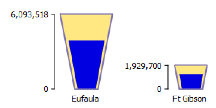
• Trapezoidal, Constant Top and Bottom Widths: Each teacup has the same top and bottom width. The side slope of teacups is not the same among teacups in the group.
Figure 6.8
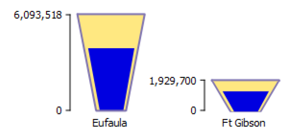
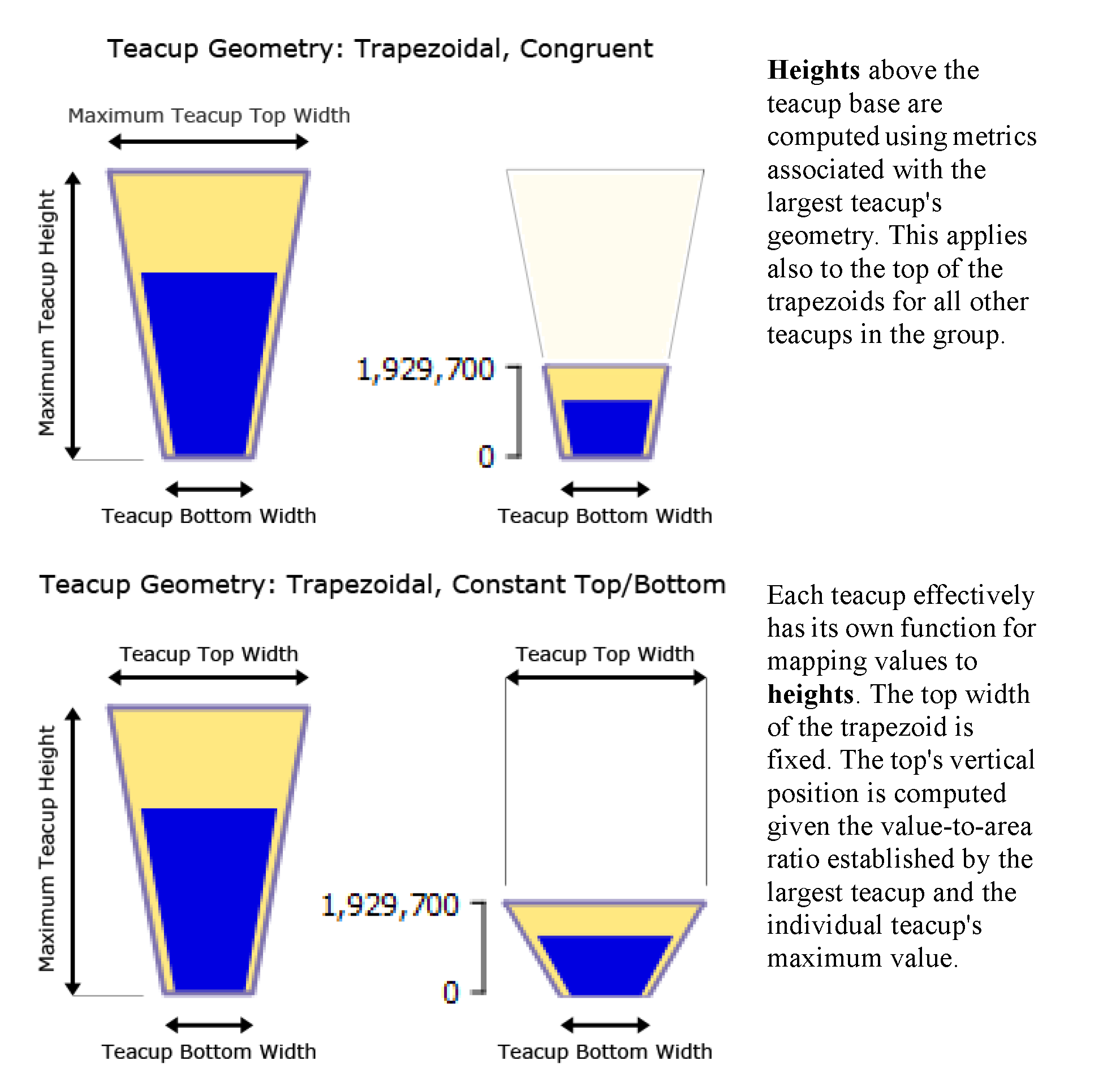
The Maximum Teacup Height applies to the teacup having the largest maximum value. The height of the teacups is computed as follows:
• In the Rectangular geometry, all other teacup values are mapped to a vertical position above the teacup's base, proportional to the value-to-vertical-pixel ratio defined by the largest teacup.
• For both Trapezoidal geometries, a value-to-area ratio is computed from the largest teacup. That computed value-to-area ratio is then used for computing geometries within all teacups within the teacup group.
Figure 6.9 shows these geometries, as applied to the largest teacup in the group and another teacup in the same group.
Figure 6.9
Show Gap
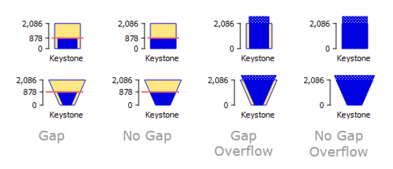
The Show Gap configuration option shows or hides the horizontal gap between the inner current rectangle (or trapezoid) and the outer maximum rectangle (or trapezoid). Figure 6.10 shows examples.
Note: Overflow values are shown with a dotted region.
Figure 6.10
Flow Line Configuration
Flow lines have a few additional configuration options that are described in the following section. See Instructions for Creating a Flow Line Diagram for details.
Flow Line Thickness
Each flow line's thickness is an interpolation based on minimum and maximum values and thicknesses. The maximum value should be devised in relationship to the maximum values amongst all flow lines in the group.
A flow line's thickness is computed from value and thickness interpolation settings defined within the containing flow line group.
At the reference timestep, when a flow line's value is... | ... the flow line is drawn with |
|---|---|
Equal to or less than the Minimum Value | the Minimum Thickness. |
Between the Minimum and Maximum Values | Linear interpolation between Minimum and Maximum Thicknesses. |
Equal to or greater than the Maximum Value | the Maximum Thickness. |
Note: There is no expectation that all encountered values will be within the Minimum and Maximum Value range. Flow line thickness for values outside that range will be shown at the respective Minimum or Maximum Thickness.
Tip: Sample flow lines and the subsequent thickness can be shown on a Flow Line Legend. See Flow Line Legend for more information.
A reasonable minimum value is 0.0. The maximum value should be chosen which exceeds most slot values among all flow lines in the flow line group in the full time series. One way to determine a good maximum value for a flow line group is shown in Figure 6.11. This involves the following steps.
Figure 6.11
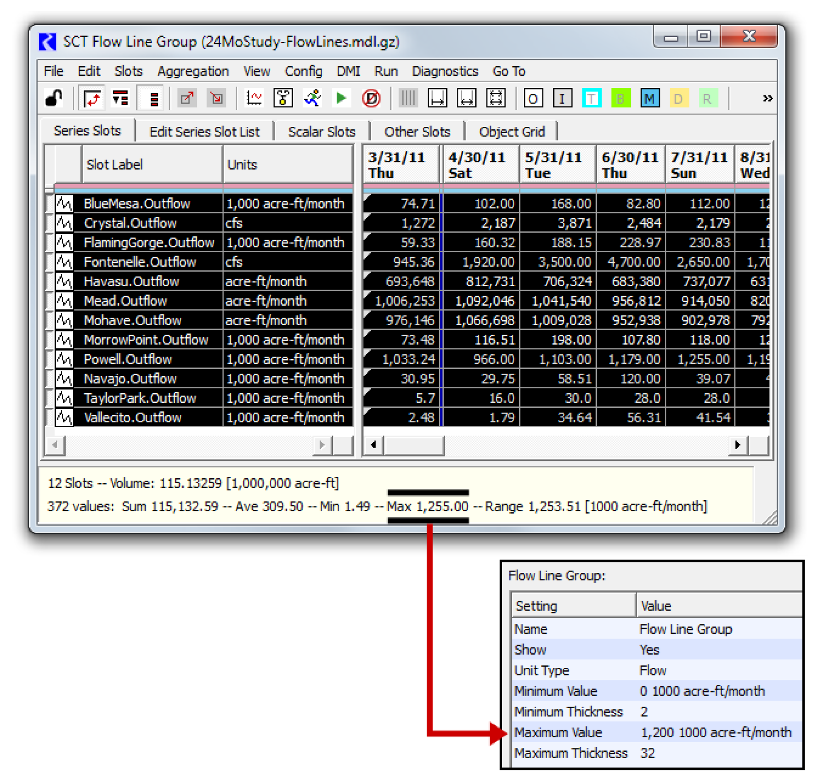
1. Right-click any of the flow lines within the flow line group and select: Flow Line Group, then Show Slots in new SCT.
2. In the resulting SCT, select all cells. (This can be done with a single select the top-left corner of the series data table).
3. In the selection statistics along the bottom of the SCT, notice the Max value.
4. Enter a number slightly larger in the Flow Line Group's Maximum Value settings.
Flow Line Color and Style
A flow line's color and style are based on the flow line's current value and where it falls within the defined intervals. The intervals are defined for the group while the thresholds are defined on each flow line. The following section describes the Interval definitions, then the threshold specification.
For a Flow Line Group, the Interval Definitions setting item indicates the number of intervals currently defined. Double-clicking that item presents Click to edit and More. Select More to show the Flow Line Value Interval Display Attributes editor dialog as shown in Figure 6.12.
Figure 6.12
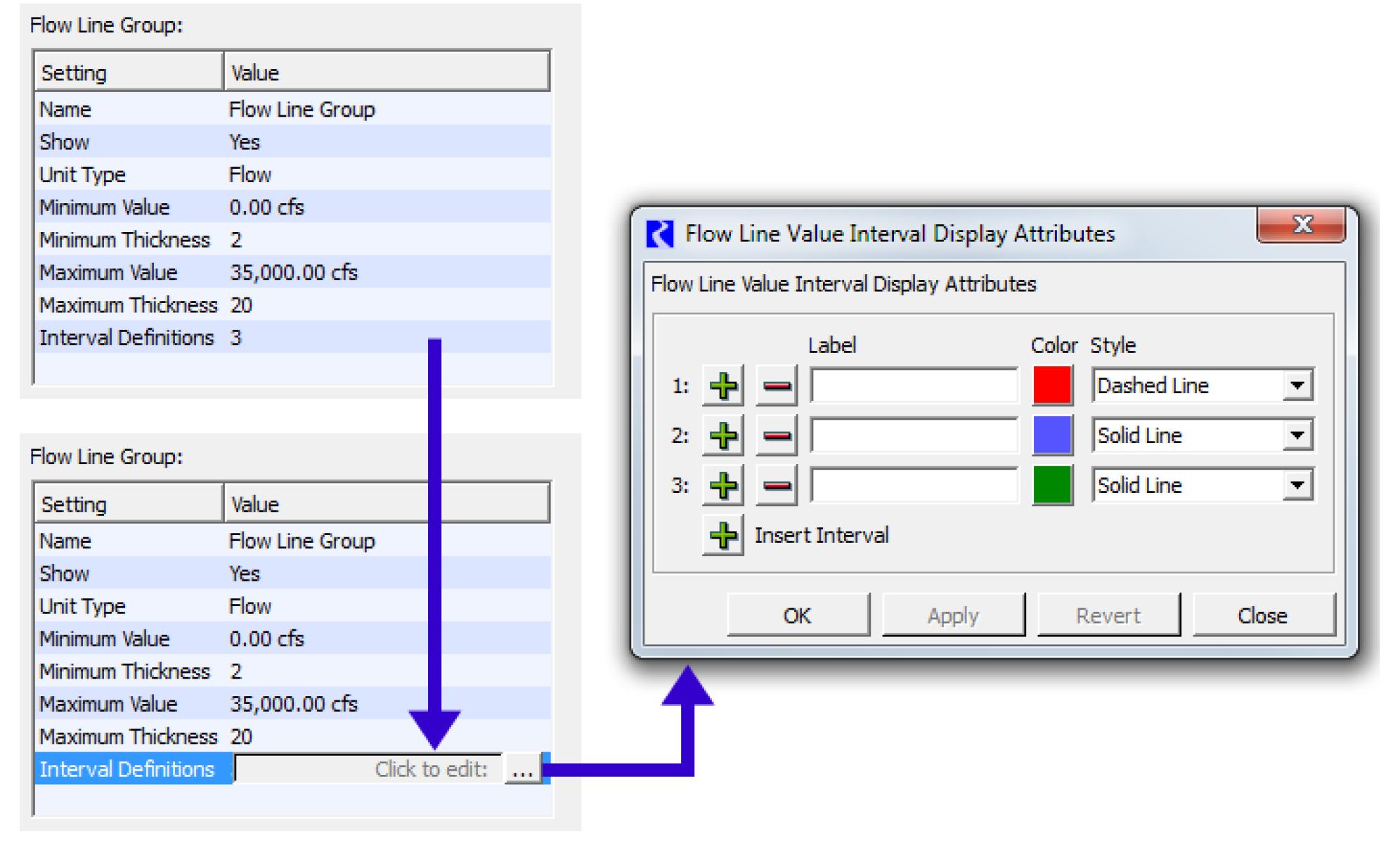
Using the Plus + button, specify up to nine intervals (Eight Thresholds). The top interval row is for the lowest flow values -- i.e. not exceeding any of a flow line's threshold values. Each interval definition has a text label (used in a Flow Line Legend), a color, and a line style.
Note: In the current implementation, the non-solid line styles look best with thin flow lines, as the size of the dash or dot is a function of the line thickness.
Once the intervals are configured and you have created flow lines, now you can specify the threshold values for each Flow Line, specify the thresholds in the Threshold 1 through Threshold N settings. Threshold 1 should be a lower flow than Threshold 2, and so forth. Figure 6.13 shows a flow line group with Two thresholds and three Intervals. The values for each threshold are specified on the individual flow lines.
Tip: The labels and specified color and style for each interval can be shown on a Flow Line Legend. See Flow Line Legend for more information.
Figure 6.13
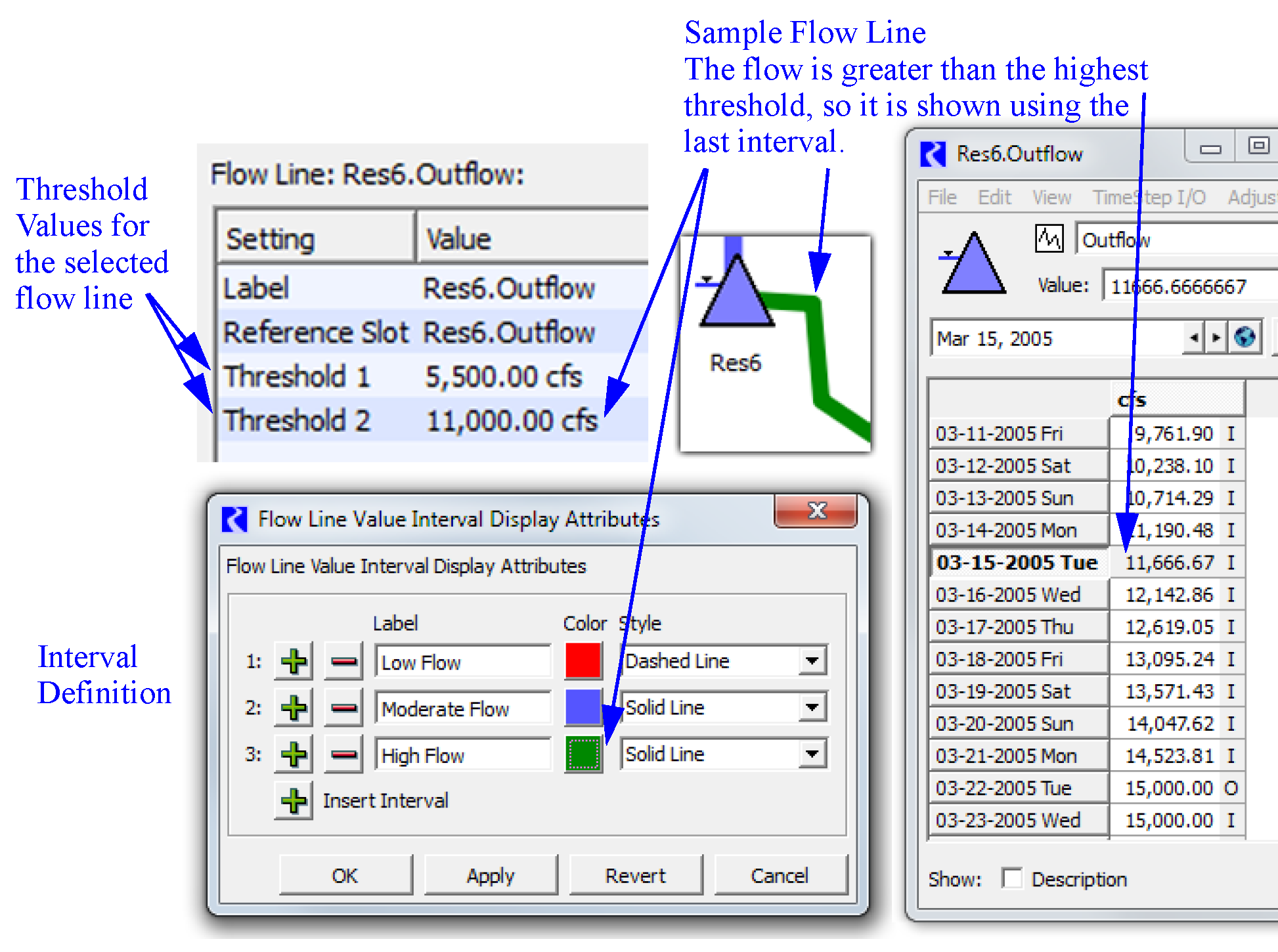
Chart Configuration
When adding a Chart to a Chart Group, the Chart selector is immediately shown.
For Chart items, you can specify the height, width, and a scaling factor either as numerical settings or by dragging on the canvas.
The chart has two dragable points which appear near the bottom-right corner.
• Scale Chart:  change scale percent, 10% to 100%. This is percentage is applied to the given height and width.
 change scale percent, 10% to 100%. This is percentage is applied to the given height and width.
• Resize Chart:  change the shape and size by adjusting the width and height graphically.
 change the shape and size by adjusting the width and height graphically.
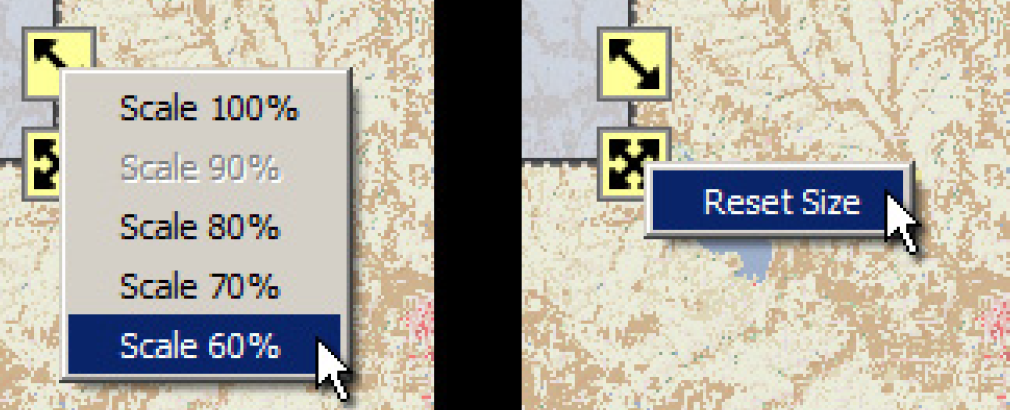
 These icons can be dragged with the mouse. The drag can be aborted by pressing the ESC key. They also support the illustrated context menu operations.
In addition, the chart can only be reduced in width and height to a certain point at which clipping will occur. If you resize it smaller, then the chart will resize to the minimum. A Reset Size operation will also resize the chart to the minimum size. The “Minimum Size” is found iteratively where the chart grows until all components fit on the chart.
Figure 6.14
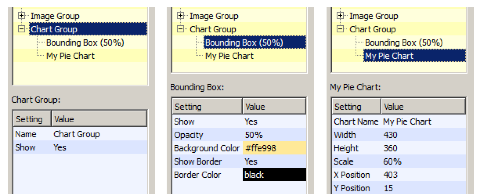
The settings supported on Chart Groups, Bounding Boxes, and Charts are illustrated in Figure 6.15.
Figure 6.15
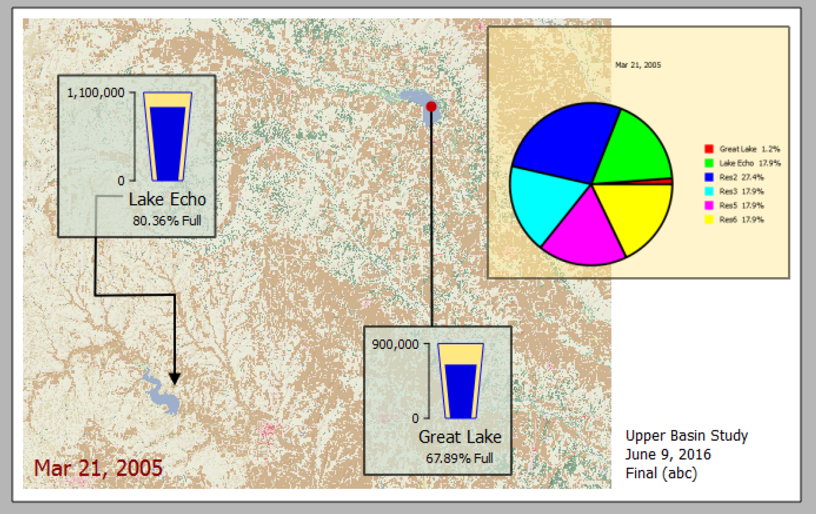
Figure 6.16
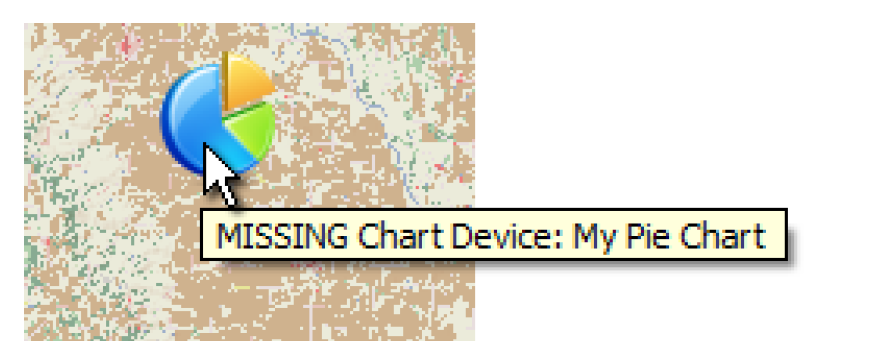
If the Chart (output device) referred to from the Chart item is missing (E.g. if the Chart output device was deleted or renamed), the placeholder icon in Figure 6.17 is shown with a tooltip indicating that the chart device is missing.
Figure 6.17
Note: Nearly all chart display and configuration changes (i.e. colors and slots shown) are made from the Chart Configuration dialog, accessible from the Output Manager.
Note: Pie Charts with labels shown in a separate legend look better on an output canvas than those with labeled wedges.
Units
All numeric values are displayed in the units associated with the Teacup Group's unit type, according to the currently active unit scheme. Select View, then Unit Scheme Manager to show the Unit Scheme Manager dialog. Precision of values is typically controlled by unit scheme but can be overridden on Teacup Groups, Text Groups and Object Icon Groups.
Canvas Preview Tab
The first tab of the panel on the right side of the dialog provides a live preview of what the output Canvas will look like when generated. In fact, this Canvas Preview should be used to define the layout of all of the items added to the canvas. Drag any item to the desired location. The X and Y Positions will update automatically in the settings.
For Flow lines, anchor points are shown on the single selected flow line. These lines support a context menu with the following operations:
• Insert Point: Add an anchor point within a flow line at the selected position.
• Extend: Add an additional point beyond the selected end-point. This is available only on the flow line's two end-points.
• Remove Point: remove the anchor point This is enabled only when the flow line has three or more points.
Figure 6.18
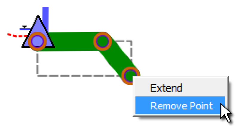
By adding many anchor points, you can use flow line to connect two reservoirs, two teacups, or even follow the river channel on the background image.
You can lock items using the checkboxes at the bottom right. Those images that are set to be background layer are controlled by the Background Images checkbox. All other items are locked by selecting the Other Items checkbox.

Right-click any item on the preview to get a Configure menu. This scrolls the content settings on the left to that section’s settings. Additional right-click context-specific menus are available where appropriate.
Figure 6.19
Revised: 07/17/2020